Transfez®
Transfez®
Transfez®
Transfez®
Transfez®
— (
— (
— (
— (
— (
App Design
App Design
App Design
App Design
App Design
-
-
-
-
-
2024
2024
2024
2024
2024
)
)
)
)
)
(Scroll)
(Scroll)
(Scroll)
(Scroll)

Redesign of the registration and KYC experience in a cross-border remittance app.
Redesign of the registration and KYC experience in a cross-border remittance app.
Redesign of the registration and KYC experience in a cross-border remittance app.
View live product
View live product
View live product
View live product
Client
Client
Client
Client
Transfez®
Transfez®
Transfez®
Transfez®
Project Type
Project Type
Project Type
Project Type
App Design
App Design
App Design
App Design
Industry
Industry
Industry
Industry
Finance
Finance
Finance
Finance
Year
Year
Year
Year
(
(
(
(
2024
2024
2024
2024
)
)
)
)
(Background)
A cross-border money transfer app that enables users in Indonesia to send IDR to 70+ countries, with automatic conversion into the recipient’s local currency. In January 2024, we observed a noticeable decline across key acquisition metrics:
New Paid Users (NPU)
Registered users
Verified users (KYC completed)
This trend signaled potential friction in our early user journey. To address this, I initiated a full review of the end-to-end registration and KYC flow to identify where users were dropping off and why.
(Challenge)
The biggest challenge was improving conversion without compromising regulatory and technical constraints. Data showed two major drop-off points in the funnel (both below 80% conversion), indicating that users were losing momentum early—particularly when the process felt too long, demanding, or unclear.
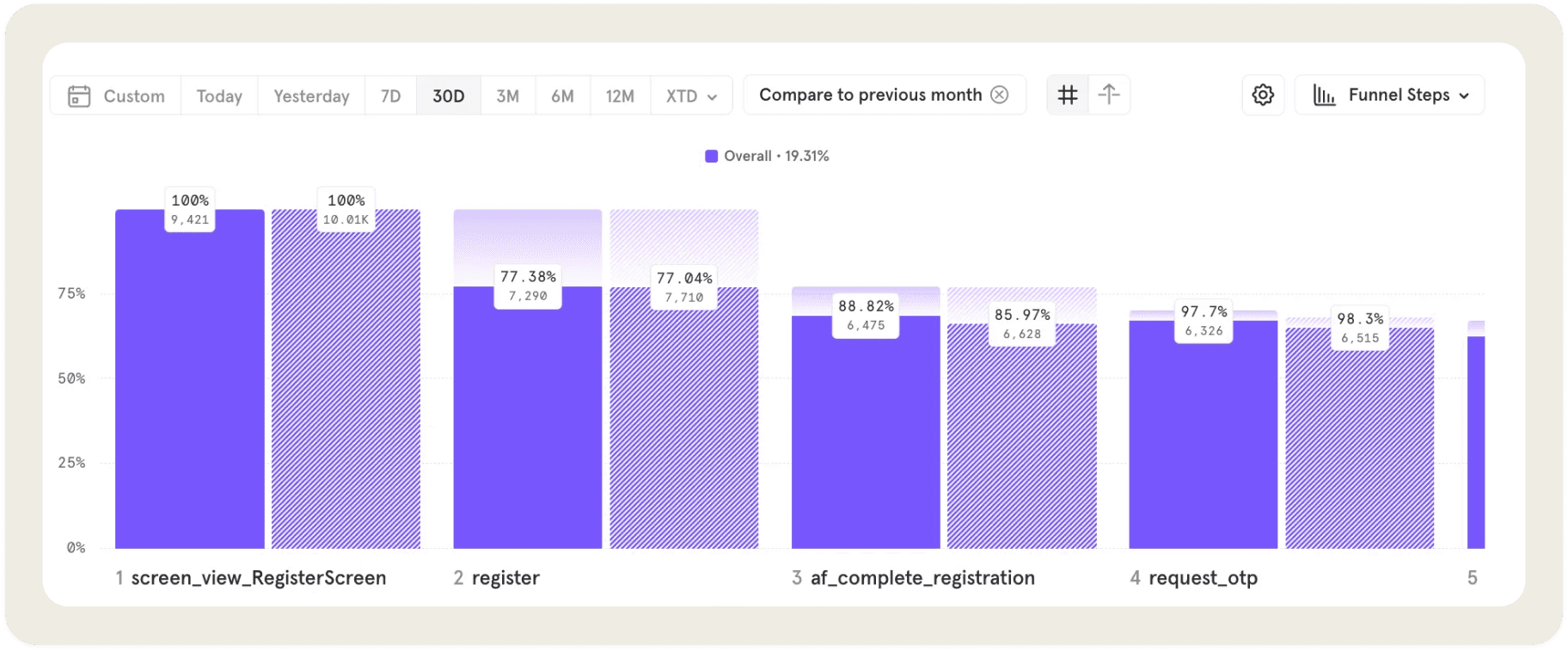
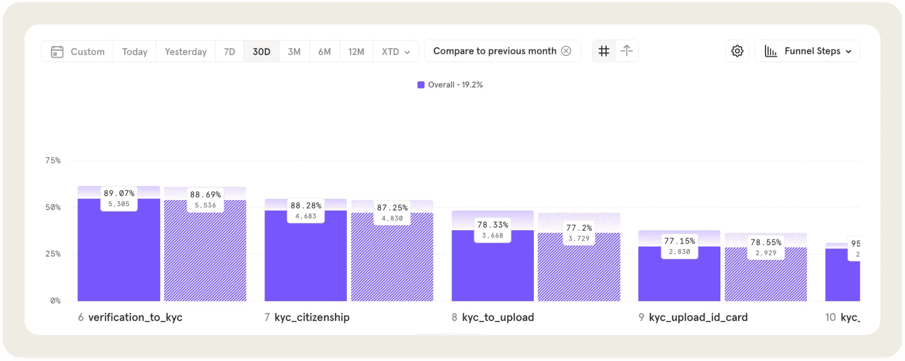
At the same time, KYC is a mandatory requirement in fintech, meaning the solution couldn’t simply remove steps. The challenge was to:
Reduce perceived friction
Build trust and clarity
Keep users moving forward through a required but sensitive process
The biggest challenge was improving conversion without compromising regulatory and technical constraints. Data showed two major drop-off points in the funnel (both below 80% conversion), indicating that users were losing momentum early—particularly when the process felt too long, demanding, or unclear.
At the same time, KYC is a mandatory requirement in fintech, meaning the solution couldn’t simply remove steps. The challenge was to:
Reduce perceived friction
Build trust and clarity
Keep users moving forward through a required but sensitive process
(Design Strategy)
Make progress and requirements clear upfront |
|---|
The old design:
Users had to guess how many steps were left. They also needed to select their citizenship first just to understand which documents were required.
The new design:
Introduced clear progress indicators (e.g., Step 1 of 5) with labeled steps (e.g., Nationality)
Displayed all required documents upfront, without extra clicks
Replaced the term “Citizenship” with “Nationality”
Used a conversational question — “Are you from Indonesia?” — to make the step feel more natural and easier to answer
Simplify ID selection and review |
|---|
The old design:
The interface made it feel like users had to upload multiple IDs (National ID, Driver’s License, Passport), even though only one was required.
The new design:
Minimized cognitive load and reduced the feeling of being “asked too much” at once.
Set e-KTP as the default primary option
Allowed users to switch ID types within the same screen using a slider
Enabled ID photo review within the same screen, removing unnecessary back-and-forth
Simplify document review into a single step |
|---|
The old design:
Users were required to review their information across two separate steps:
First: personal data
Second: address details
Additionally, the “Check your document” screen included a retake ID photo action, which was not relevant to the purpose of the page and added unnecessary confusion.
The new design:
Reduced redundant steps and helped users complete the review phase faster and with more confidence.
Consolidated data review into one single screen
Organized content into clear sections: Personal information at the top, and address details below
Removed unrelated actions to keep the page focused solely on reviewing submitted documents
Refine UI and UX across the flow |
|---|
Beyond structural changes, I refined multiple screens to improve:
Visual clarity
Copy consistency
Interaction flow between steps
These adjustments helped create a smoother, more cohesive KYC experience from start to finish.
Refine UI and UX across the flow |
|---|
Beyond structural changes, I refined multiple screens to improve:
Visual clarity
Copy consistency
Interaction flow between steps
These adjustments helped create a smoother, more cohesive KYC experience from start to finish.
Refine UI and UX across the flow |
|---|
Beyond structural changes, I refined multiple screens to improve:
Visual clarity
Copy consistency
Interaction flow between steps
These adjustments helped create a smoother, more cohesive KYC experience from start to finish.
(Impact)
(Impact)
Registration continuation rate increased from ~77% to ~83% after improvements were applied
KYC completion rate improved from ~77% to ~81%, indicating reduced friction during verification
Early-stage drop-offs decreased, contributing to healthier top-of-funnel conversion
Metrics observed after iteration rollout in February 2024.


(Contact)
Let’s work together.
(Contact)
Let’s work together.
(Contact)
Let’s work together.
(Contact)
Let’s work together.
(Contact)
Let’s work together.
© 2020—2026
© 2020—2026
© 2020—2026
© 2020—2026
© 2020—2026